Dashboard UI Journey
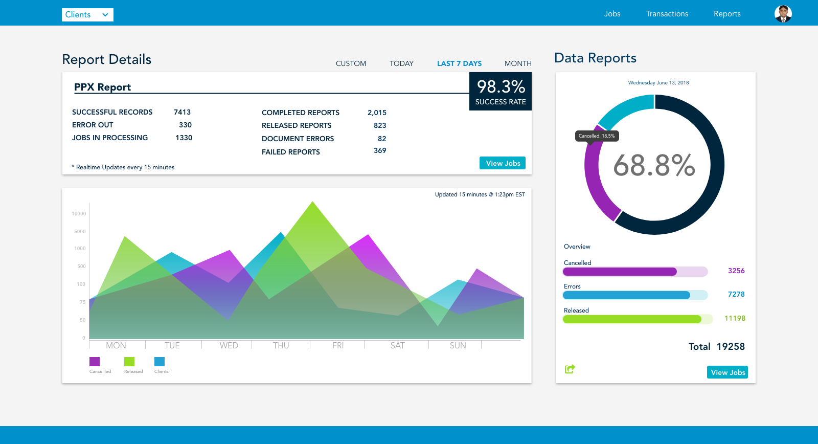
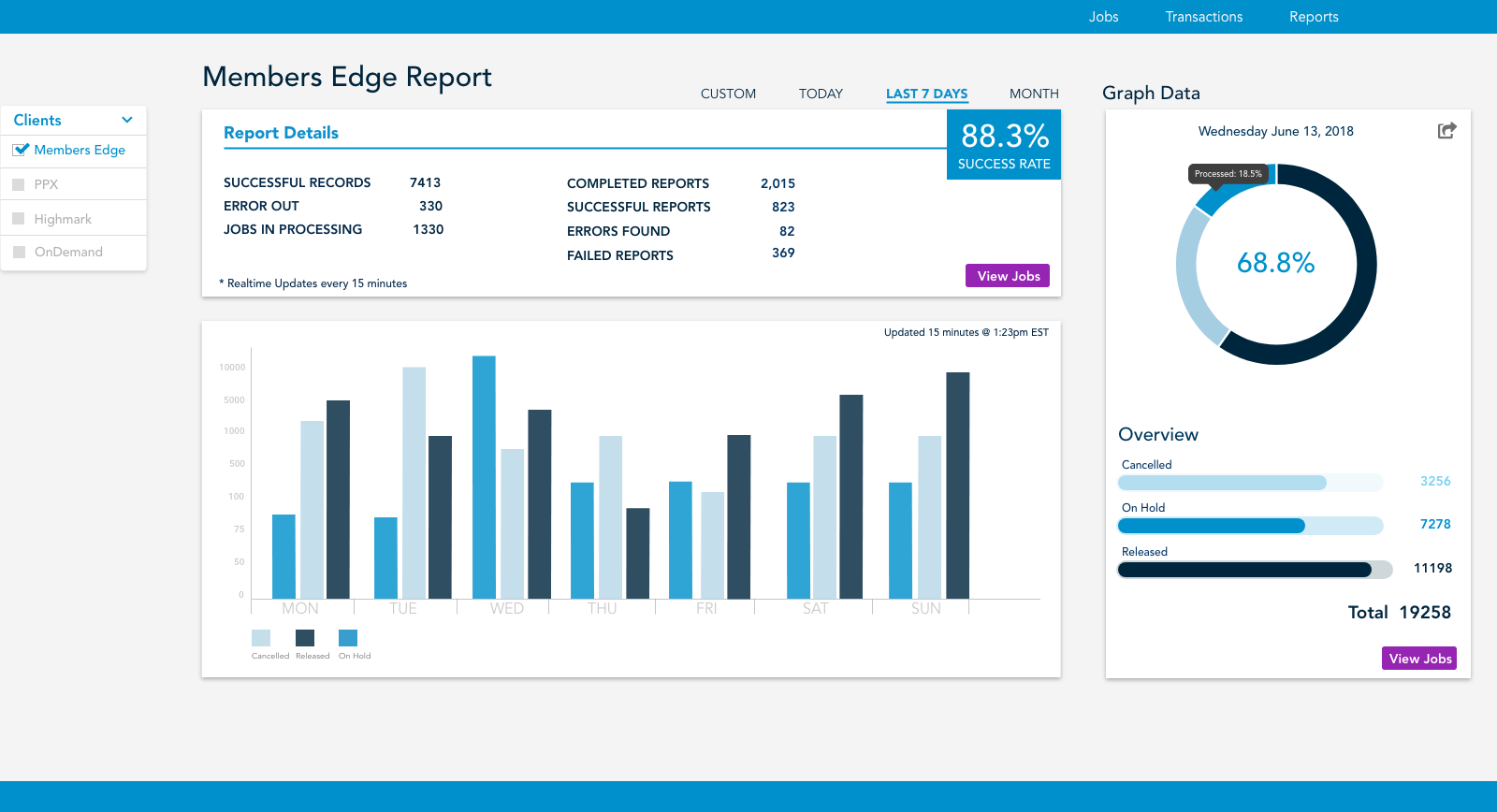
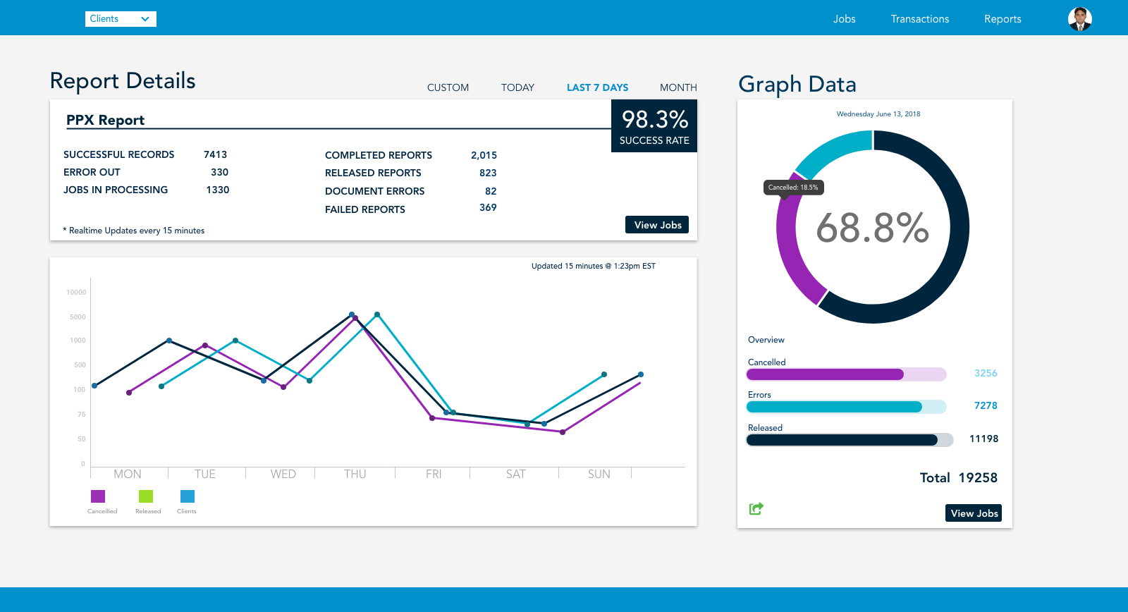

Why a Re-Design?
Because of this daily report the developers use to track data! Let’s move on…
communication and optimization dashbord
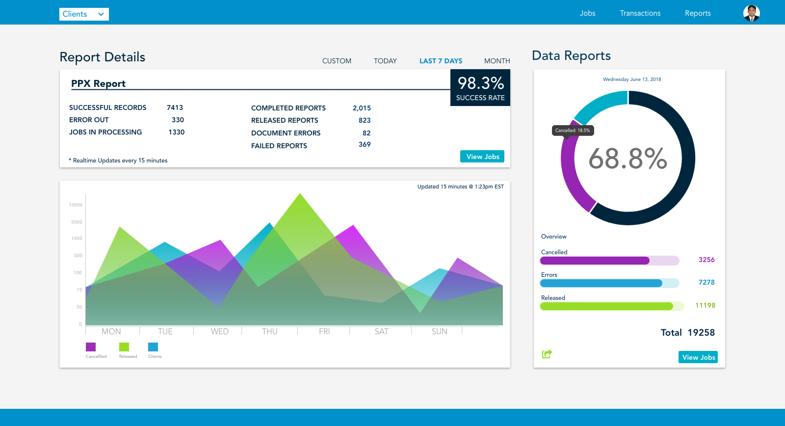
The purpose of the dashboard is to bring together all of the multi-line channels of communication wether it’s digital, paper, or audio touch points the business has made or will be attempting within the next 5 day business cycle.
As the Lead Designer
I served daily directly under the Communication and Optimization Product Owner as the Lead designer working in an Agile environment to create an automated communication status dashboard repository for any type of digital touch points or paper mailings sent out to new and existing members. This dashboard had to be able to serve up anywhere from 500 to 10,000 jobs and transactions in any given day.
I was involved from the very beginning shortly after joining GuideWell/Florida Blue. Some like to say “Thrown into the fire”😵So, fast forward a week and learning as much as I could about this massive dashboard and the tens of thousands of documents that would get fed through here everyday. Sometimes reaching Fifty thousand digital and paper documents a day.
I’ve listed some of my daily tasks here:
wireframes (low and high fidelity)
Storyboards and rough mockups
Sketching and rough prototypes built in Adobe XD
Clickable/Interactive Prototypes to hand over to the development team
Managed user stories and design sessions within the Sprint working with the BA
Worked directly with Business leaders, developers, stakeholders, and the Product Owner to deliver the best user experience in the end
the Design Approach
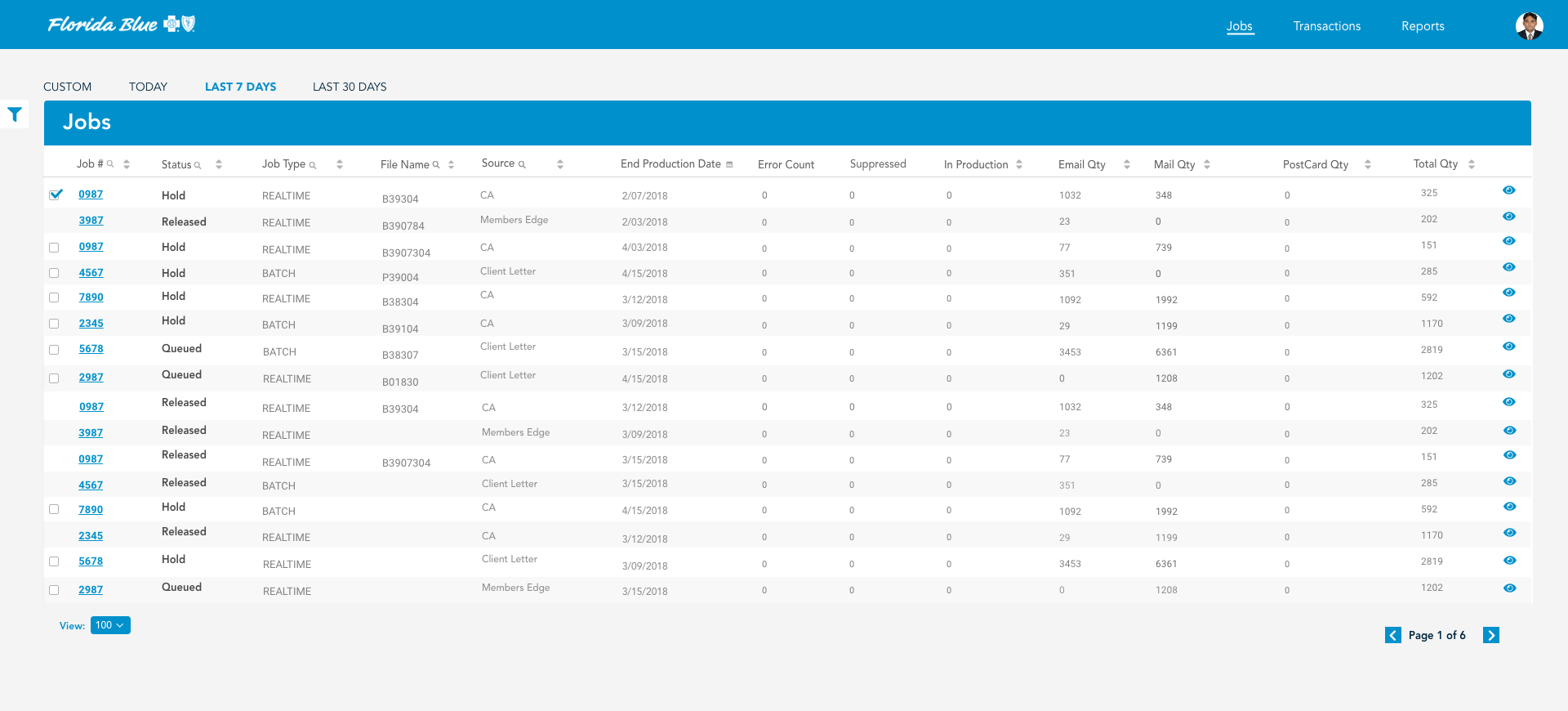
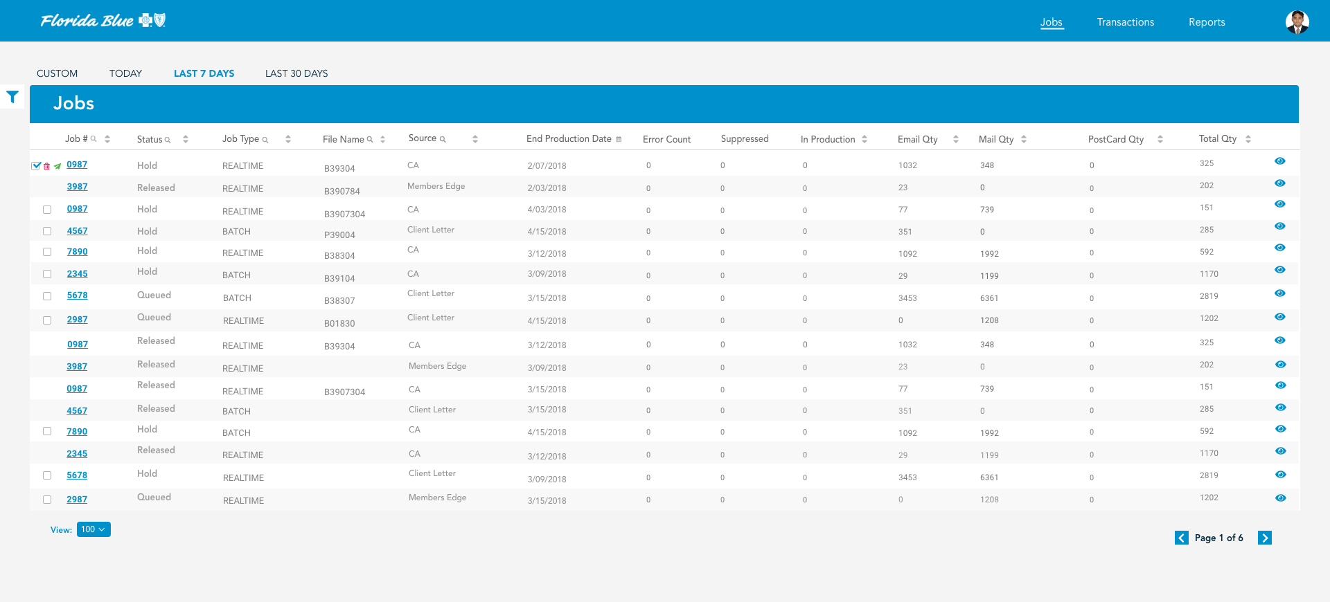
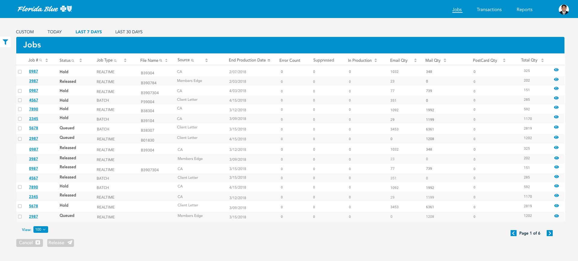
After a couple of design sessions and meetings, the Business came back and felt that the jobs and transactions screens needed to follow a design flow the representatives were already accustomed too. So, my approach was a glorified Excel design with some small micro-interactions in place to create a better user experience than what is offered in Excel today. These three images show a simple “Cancel or Release” user flow built right within the table row. Along with some iconography, I built in a “quick peek” of the job with a slide in drawer div from right to left clicking on the “eye icon”. This alone would save users over 2-3 minutes of time within the application.